Building a Data Table

Company

FinalForms

Timeline

2024 - 2025

Role

Product Designer

Project

Streamlining Ticket Distribution for Universities
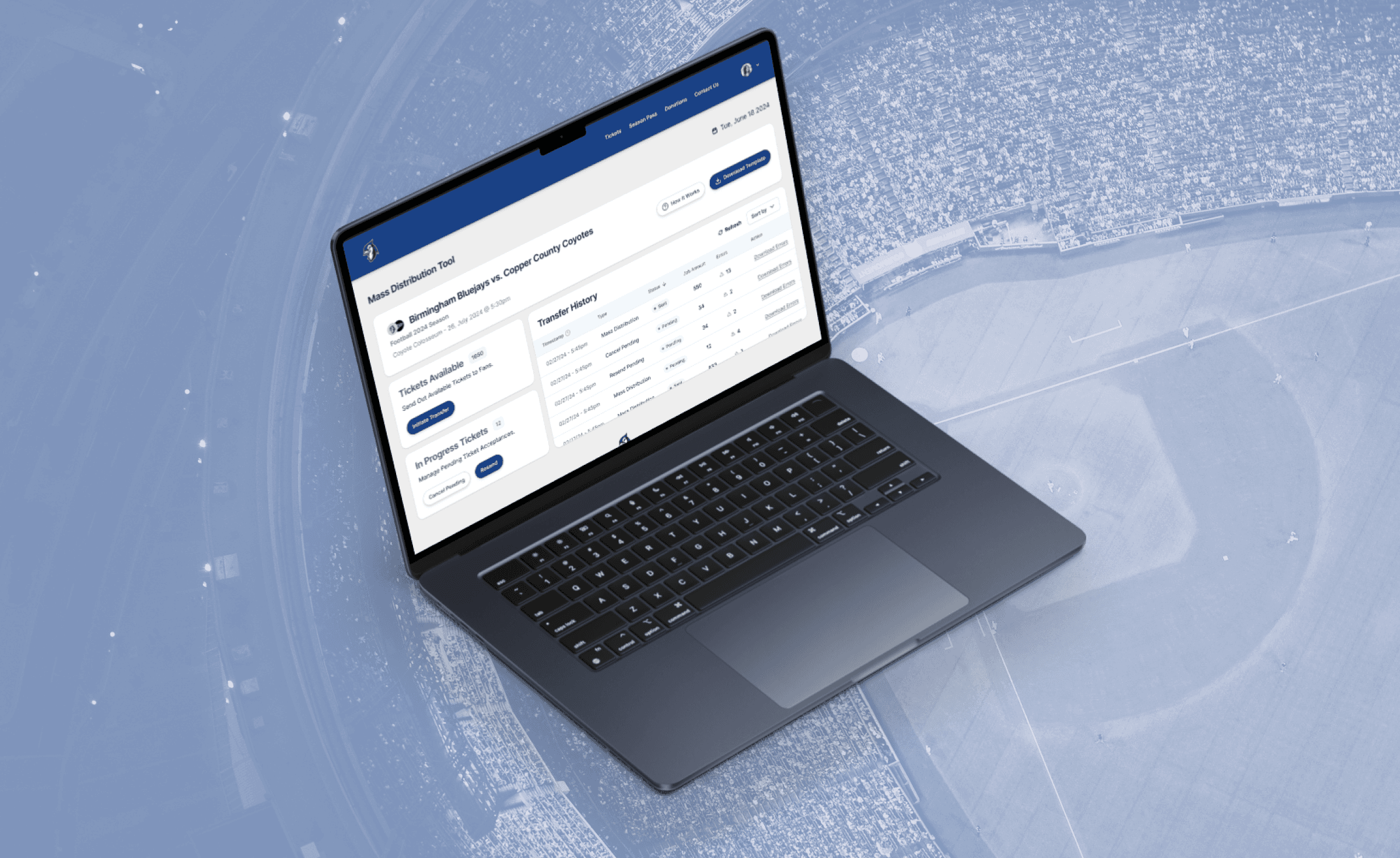
(This case study has been anonymized to safeguard sensitive company information. Any similarities to actual companies, organizations, or proprietary data are purely coincidental.) A anonymous leading ticketing company specializing in college athletics provides comprehensive ticketing and event management solutions. One significant challenge the company was facing involved the efficient distribution of visitor team tickets during sporting events hosted by the home team.
ClientTicketing Company
RoleProduct Designer
Year2024


Problem Statement: Visitor teams encounter complexities in distributing their allocated tickets, involving manual compilation of student requests, submission to the home team, and labor-intensive individual ticket distribution. Existing solutions within the company's ecosystem do not extend to schools partnered with competitors, necessitating a new approach for seamless ticket distribution.


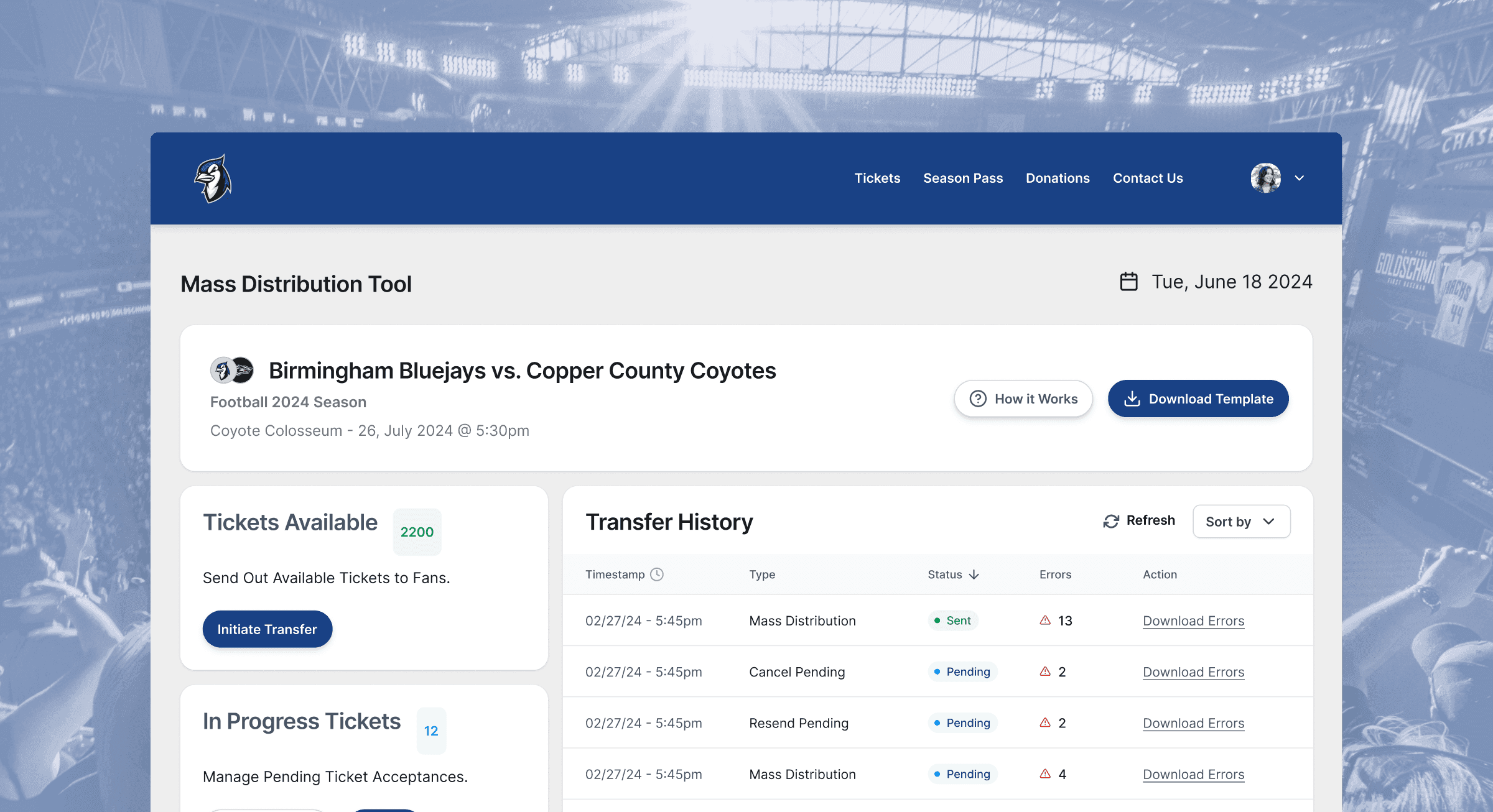
Solution: The solution proposed was a Mass Distribution Tool designed to simplify and expedite the ticket distribution process for visitor teams. This tool allows the visitor team to upload a pre-filled spreadsheet of ticket recipient details. Upon submission, tickets are automatically sent out en masse to their fans, rather than the need for home teams box office employees having to spend time manually processing each individual ticket (which can range in the thousands).
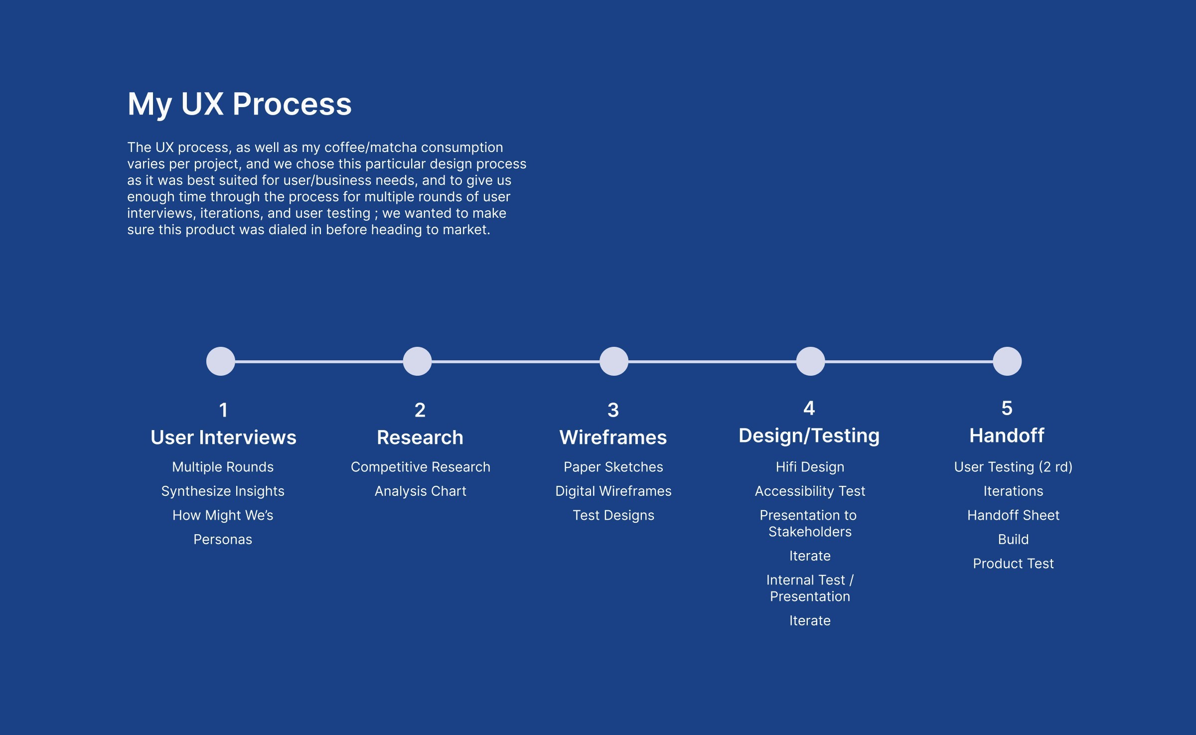


Roadmap


Key Features


  1. CSV Spreadsheet: Users can easily compile all of their ticket information into a .csv file

  2. Mass Distribution: Tool processes and sends tickets (up to 2000) to designated recipients.

  3. Error Resolution: Ability to access error logs to directly fix any transfer issues.

  4. Status Reports: Tracks ticket status (accepted, pending) and generates reports.

  5. User Guidance: Includes a 'How It Works' section with informational walkthrough for user assistance.

  6. Event List Page: Allows visitor teams to access ticket management for all upcoming games


User Research

(Specific user research details, and commentary will be left out to protect IP)


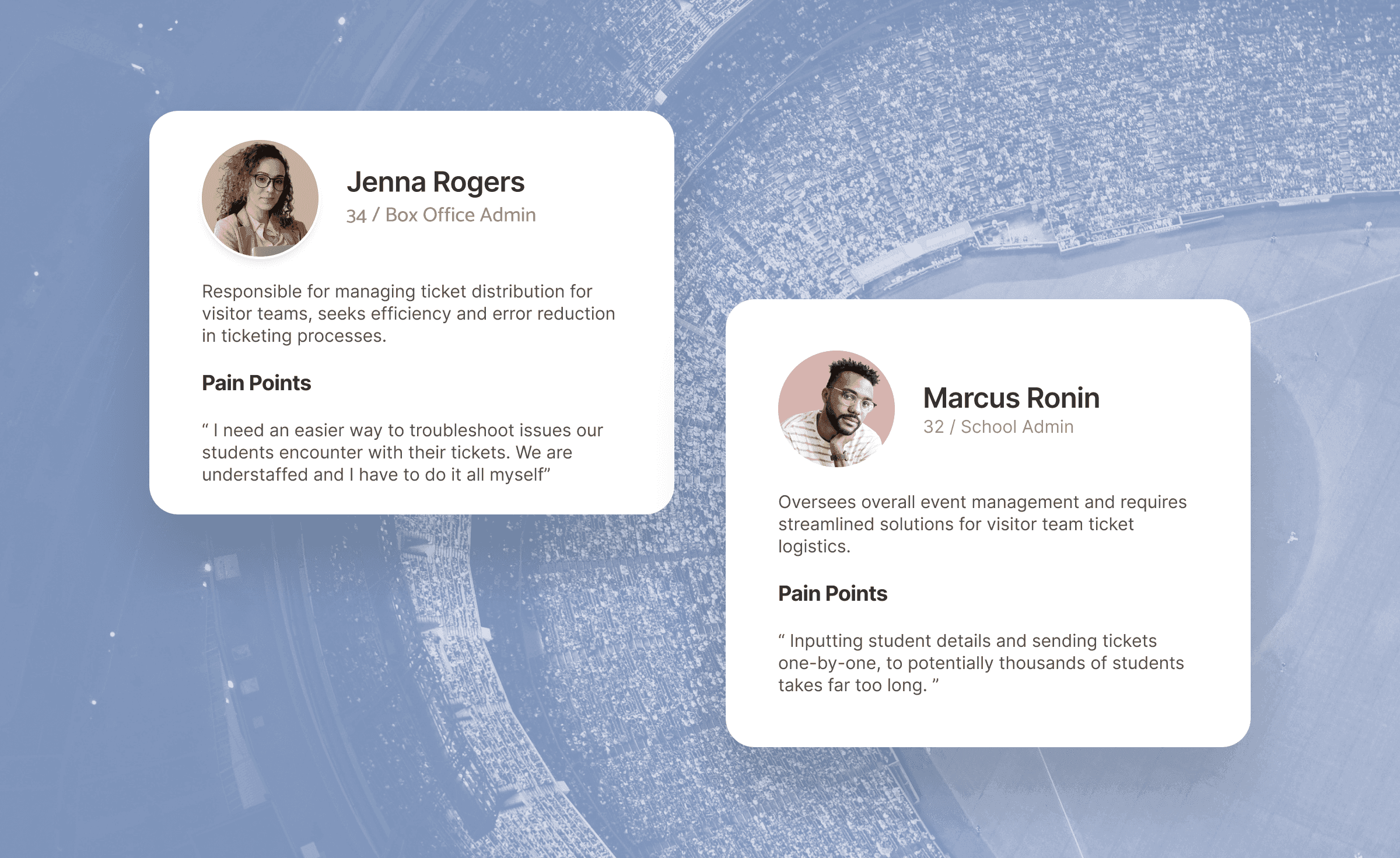
User-Centric Approach: The project began with five rounds of user interviews conducted over three weeks, engaging approximately 15-20 clients from various universities. These interviews provided deep insights into existing frustrations and pain points with ticket distribution processes. From the first interviews, we got a sense of the typical journey map, which we walked through with the stakeholders during workshops to have them drop their feedback ; Feedback highlighted the need for automation, error reduction, and improved efficiency.


Some examples of questions we were seeking answers to were:

- What obstacles do you typically encounter when collaborating on ticketing with visiting schools ?
- How many tickets do you generally send out to visitor teams per game (& per sport)?
- Are there difficulties troubleshooting tickets that are sent out?
- How many unaccepted tickets are usually claimed at the box office on game day? How can we minimize this , and create less of a workload for box office employees?


Once enough information / insights were gathered , we developed multiple personas , plugging in each persona into a journey map


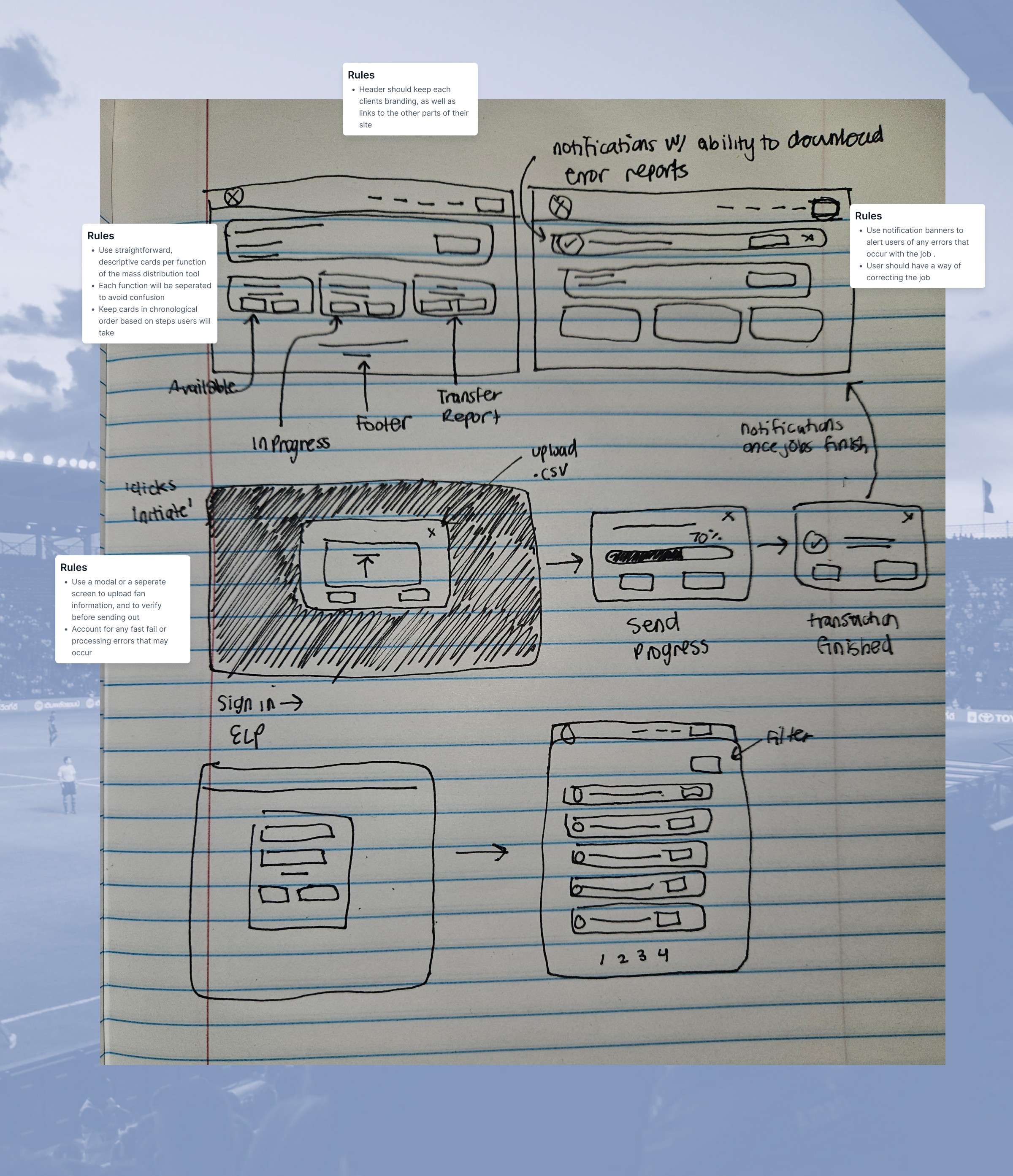
Wireframes:


Wireframes were constructed from the insights gathered. We wanted to make sure that the tool constructed would be straightforward, easy-to-use, and accounted for any type of error the user may encounter while trying to resend, cancel , or initiate transfers.


Iterative Design Process:


Based on insights gathered from user interviews, mock-ups and prototypes were developed and tested with stakeholders and end-users. The iterative testing phase included user testing sessions with college athletic clients to validate functionality, usability, and overall user experience. Feedback from these sessions informed iterative improvements to the tool's interface and functionality. These improvements included:


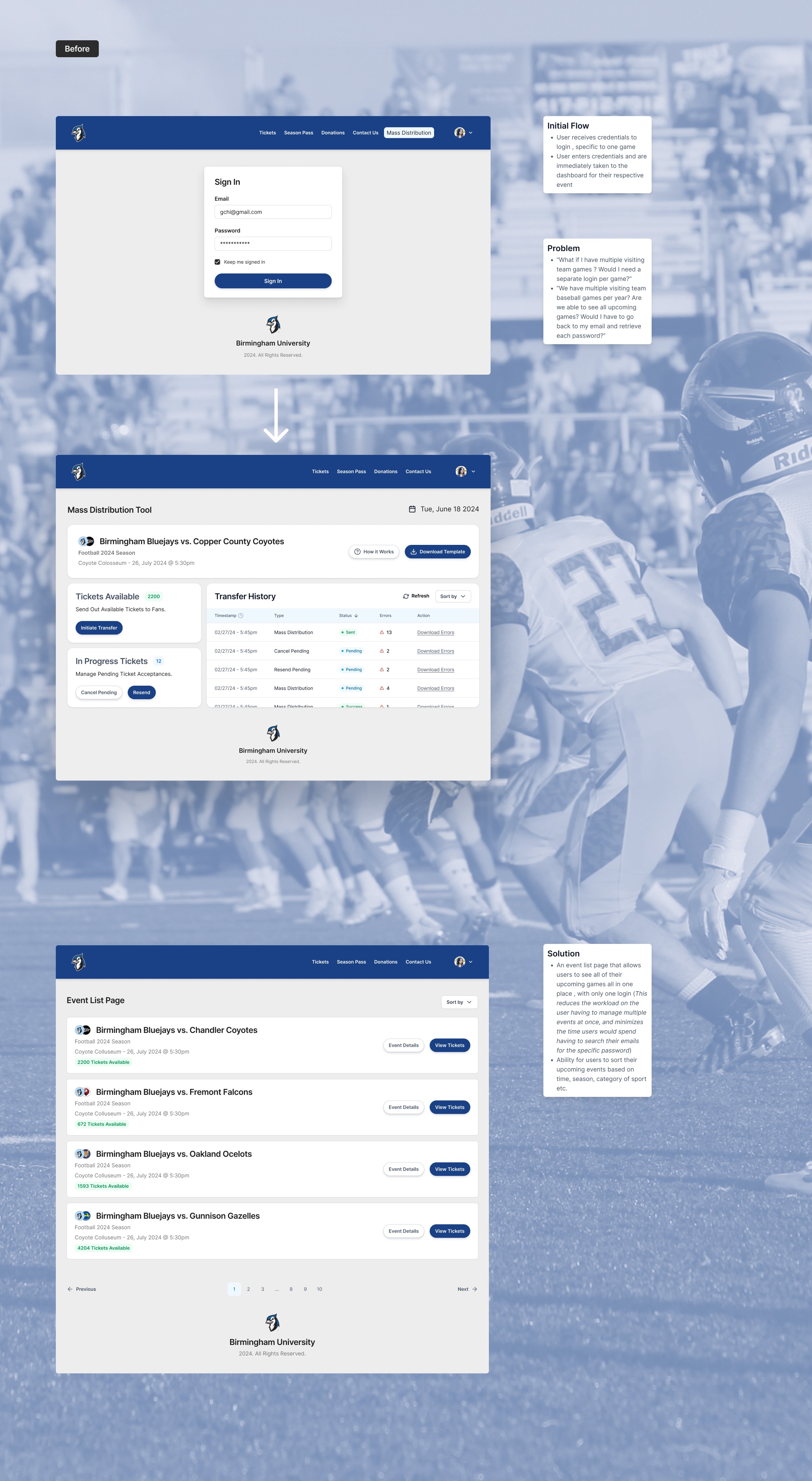
  • Eliminating Notification Banners: In Version 2, the decision to replace notification banners with a comprehensive Transfer History Table improved user experience. This ensured that users could easily track and manage ticket transfers without the risk of losing critical notifications upon logging out.


  • Removing Unnecessary Content: In Version 2, we removed the 'transfer download report' card to reduce clutter since the new Transfer History Table would serve to show all pending, canceled and successfully sent transfers. This also removes the need for the users to download and sift through a separate .csv file, saving our users even more time.


Technical Considerations:

  • System capacity limitations sending tickets in batches, with a cap of 500 tickets per batch to maintain system performance.

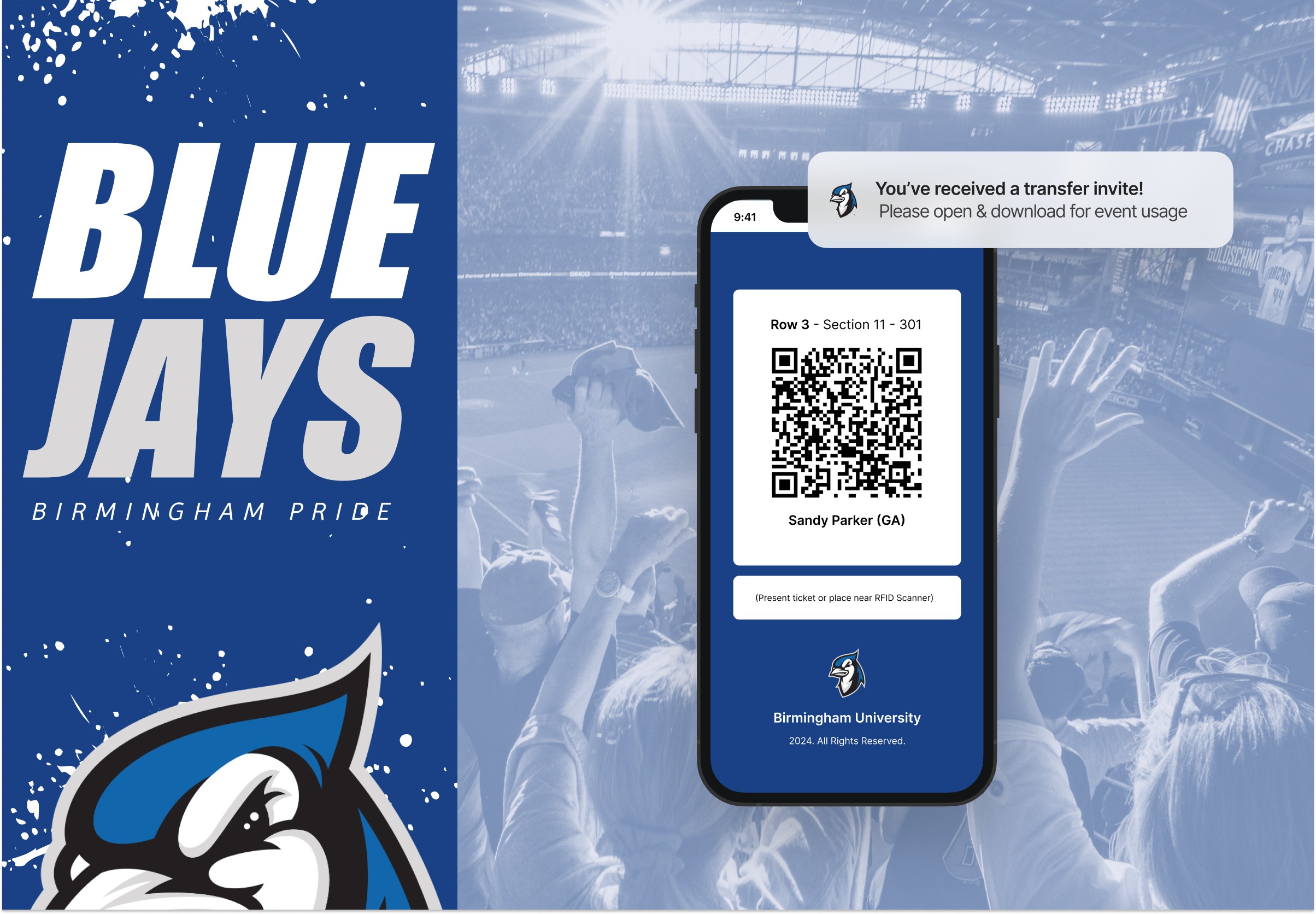
  • Notifications via email were implemented to alert users of transfer progress, accommodating busy schedules and minimizing user involvement during the process.

  • Addressing potential errors (e.g., invalid file types, duplicate tickets) through detailed error messaging and validation.


First Round of Iterations:


Additional Iterations:


  • All of Your Games in One Place: Initially based on technical restrictions / timing to push the product out to market for testing, our first version only allowed users to manage tickets for one event per login credentials. I argued for the expansion of the interface , to allow users to be able to handle all of their events in one place (kind of like an all-in-one portal). I wanted to make sure that the user experience was not tarnished by having to have the users memorize credentials for each event (especially if they have upwards of 50 visitor games per year) , or go through their emails to track down several different passwords.


  • Additional Information: On Version 2, on the event list page, extra details were added, allowing the user to get a preview of crucial information (number of tickets remaining, event location, event time, season, sport, etc.) saving users time from having to click into an event and find the information themselves.


Impact


The Mass Distribution Tool significantly enhances operational efficiency for both home and visiting teams:

  • Saving Time: Reduces manual labor at home team box offices, allowing staff to focus on other tasks.

  • Improved User Experience: Simplifies the ticket distribution process for visiting teams, enhancing overall client satisfaction.

  • Scalability: Designed to handle high volumes of ticket transfers, accommodating up to 2000 transfers at a time.

  • Adaptability: Provides flexibility with dual delivery methods (email and text message) and ability to manage errors.


A brief look at the typical user flow of the Mass Distribution Tool



Conclusion


  • The Mass Distribution Tool introduced by the ticketing company addresses critical pain points in visitor team ticket distribution, enhancing operational efficiency for both home and visitor teams. By leveraging user-centric design principles and iterative development, our team did not only improve user experience but also streamlined a complex process, setting a new standard in collegiate athletics ticketing solutions.


    Takeaways:

  • Though this was an expedited project, I appreciated the collaboration with the PM (She's a rockstar , seriously) and how we went about tackling the rounds of user interviews . I truly think that it helped pave our deep understanding of the users pain points, and made the design process more smooth

  • For future iterations , I would like to add in the ability within the table to cancel single transfers (utilizing checkboxes) as well as the ability to correct the errors via the table vs. mass editing with the csv

FinalForms Students data table � desktop and mobile

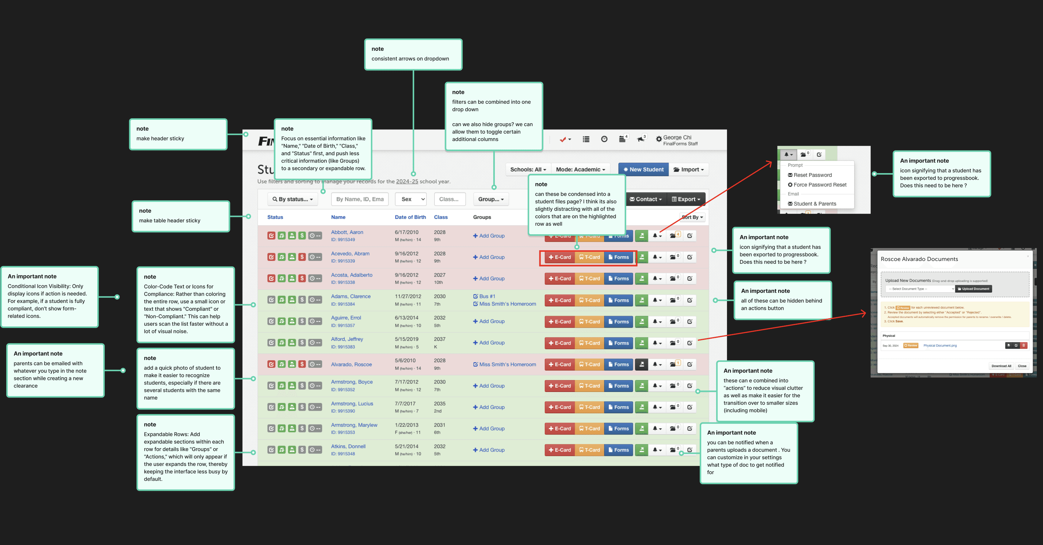
Data tables are the beating heart of FinalForms. Used daily by tens of thousands of athletic directors, coaches, school nurses, and district administrators, these interfaces are the primary operational engine for managing high-stakes compliance data. Every single day, users rely on them to perform legally binding actions—from verifying a student’s medical clearance to play a sport to certifying state-level enrollment status and athletic eligibility.

For the past 13 years, the underlying architecture has carried the weight of this workflow. However, it has evolved into a monolithic legacy system that struggles to support the dynamic needs of its diverse user base. A school nurse looking for immunization records and a district athletic director auditing multi-school rosters require entirely different lenses into the data, yet they have historically been funneled through the same rigid interface.

Redesigning the FinalForms data table ecosystem is not merely a visual update; it is a fundamental system modernization. The challenge lies in creating a unified, highly adaptable component architecture that seamlessly switches context between Academic, Athletic, Extracurricular, Medical, and Enrollment modes—all while scaling effortlessly from a single school building to an entire district. This case study explores how we untangled 13 years of legacy workflows to build a flexible, high-performance table system capable of handling complex compliance at scale.

Discovery: Building the Room (Quarterly Workshops)

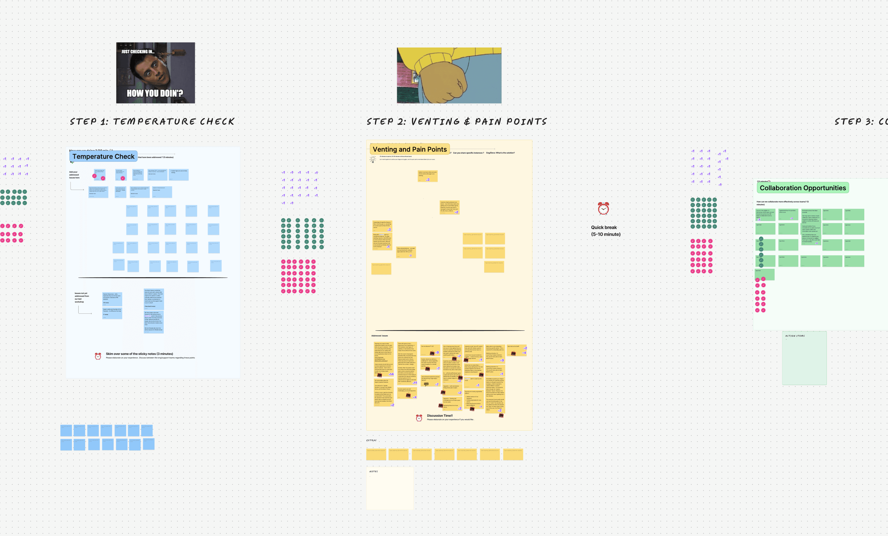
I started running a quarterly, 90-minute workshop that pulled over 60 teammates (engineering, support, onboarding, and sales) into one facilitated space: a temperature check, venting & pain points, collaboration opportunities, and an open forum. This allowed our team members who all interact with clients differently, to air out their thoughts as to what aspects of our software should change (with a lot of the issues being tied to our data table).


Widening the Investigation

Alongside the workshops, I ran individual meetings with teammates who flagged specific interface concerns, and sat in on calls with the sales team specifically to understand what they were hearing from prospects and why we were losing deals. Some of what surfaced was directly tied to the table functionality.

(photo0

Sythesize

I synthesized everything: workshops, one-on-ones, the competitors UI, and sales calls, and logged all of my findings. I then extracted the requests related to the data tables.


The questions behind a year of work

This redesign ran about a year because every decision had downstream effects across five modes, three personas, and two platforms. A sample of what had to be worked through:

  • Which tasks belong on mobile (and whether admin work on mobile worth the engineering effort)

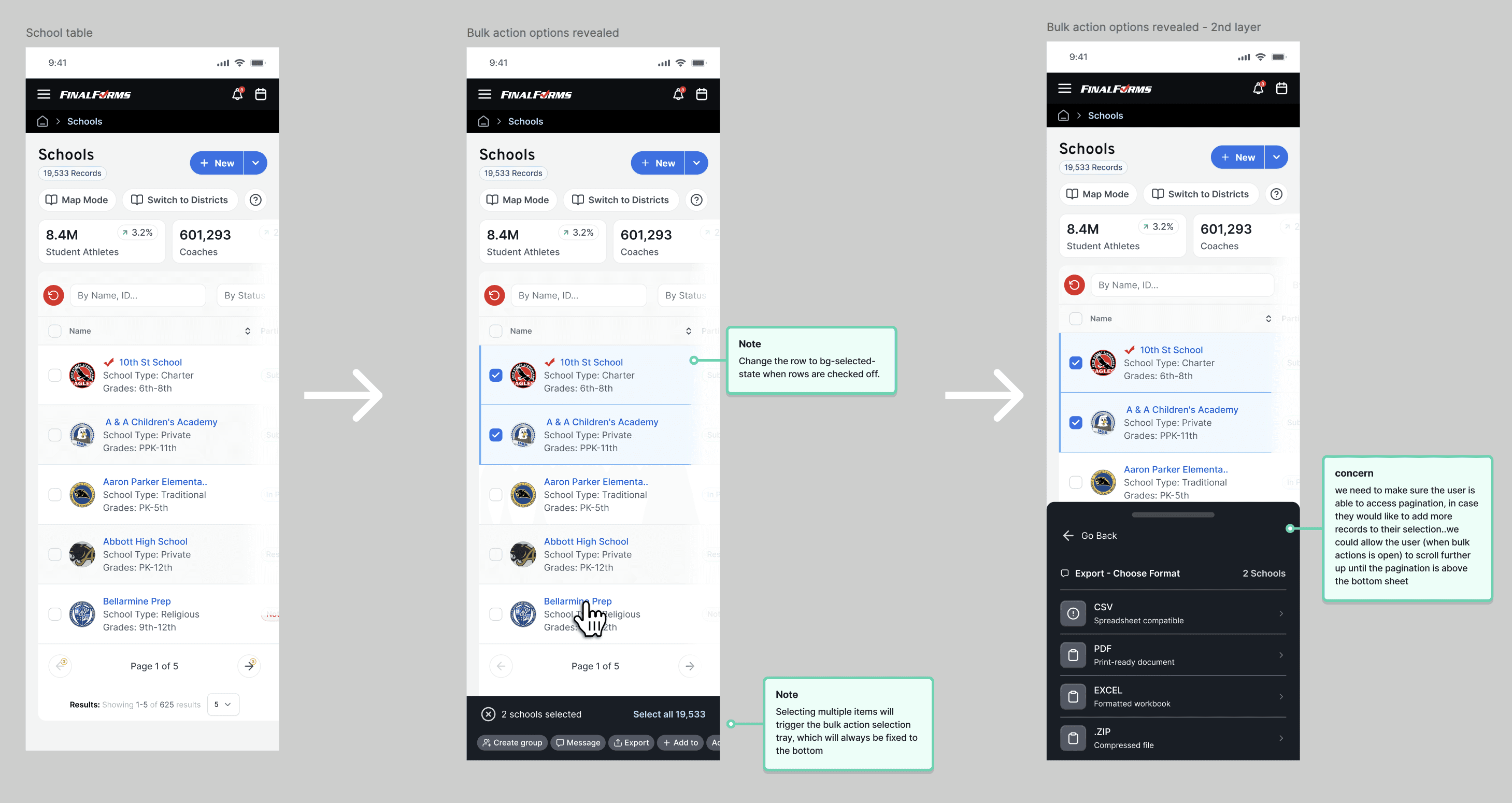
  • Multi-select & bulk actions

  • Inline filtering

  • Infinite scroll vs pagination at scale

  • Row-level vs table-level actions

  • Which user types rely on each of the five modes

  • How permissions change what a user even sees

  • Full keyboard-only completion and color accessibility

  • Onboarding a first-time user to a table this dense

  • Whether profile photos help scanning (especially repeated last names)

  • Which single column the eye should land on first

  • Truncate vs horizontal scroll on smaller screens

  • How advanced filters and sorting behave when combined


    What the Data Said

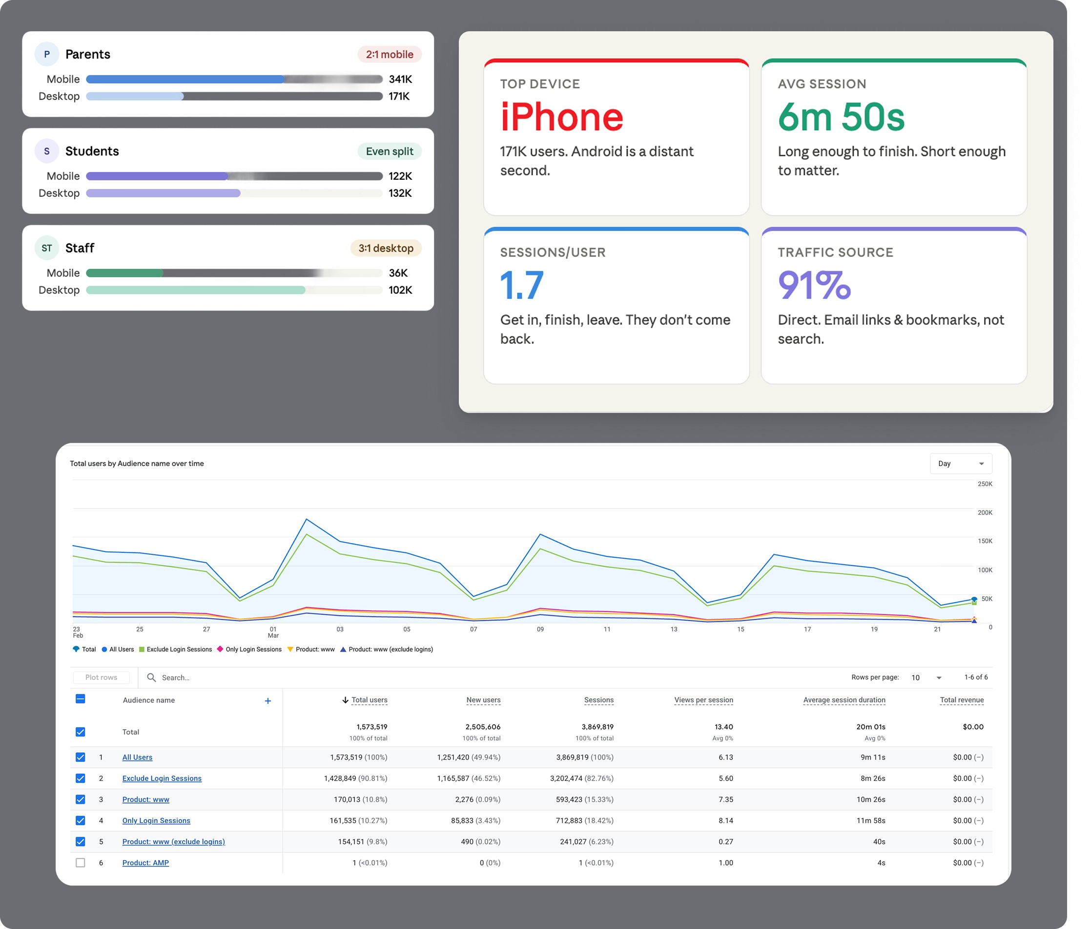
    Before deciding how mobile-first this redesign needed to be, we looked at real GA4 usage data across 1.54 million users and found:


  • Parents are 2:1 mobile to desktop usage : Their experience/main tasks with the data table should be most optimized for the mobile experience.

  • Students usage was split nearly evenly between desktop and mobile

  • Staff (the actual users of this table) , are 3 to 1 desktop: signifying /leading us to the decision that the experience and the primary staff(admin) tasks should be optimized most for the desktop experience.

    We also found gaps in our own tracking along the way, an overly broad "guest" tag catching 650K+ desktop sessions with no clear definition.

This data is key in helping us shape the various modes of the table, based on which persona is using them.


Stress-testing the patterns

A data table is much more than the displaying of rows and columns of data: There are a myriad of patterns that go into building a scalable, high-velocity workspace. All of the patterns were thoroughly researched, and tested, with internal staff, as well as real-life users to make sure the user could accomplish their tasks easily, and to reveal any potential edge cases. Certain flows, that were categoeized as an admin task, were optmized for desktop, whereas a task a student or parent would be executing, were optimized for movile.

While the full system encompasses dozens of granular interaction models, I selected six key patterns to highlight how we stress-tested the UI against complex, everyday user workflows:

  • Adding a Column (Customization): Allows users to tailor data density to their specific role—letting power operators surface critical fields while hiding non-essential metrics to streamline daily tasks.

  • Loading State (System Feedback): Prevents UI layout shifts during asynchronous data fetches, maintaining visual context and managing user expectations during heavy server calls.

  • Sorting (Data Scannability): Enables rapid reorganization of vast datasets by priority, recency, or alphabetical hierarchy without losing visual anchor points.

  • Bulk Actions (Workflow Efficiency): Accelerates high-throughput management by allowing users to select records across pages and execute batch operations in a single step.

  • Pagination (Performance & Structure): Breaks thousands of records into manageable, performant chunks—reducing cognitive load while eliminating browser rendering bottlenecks.

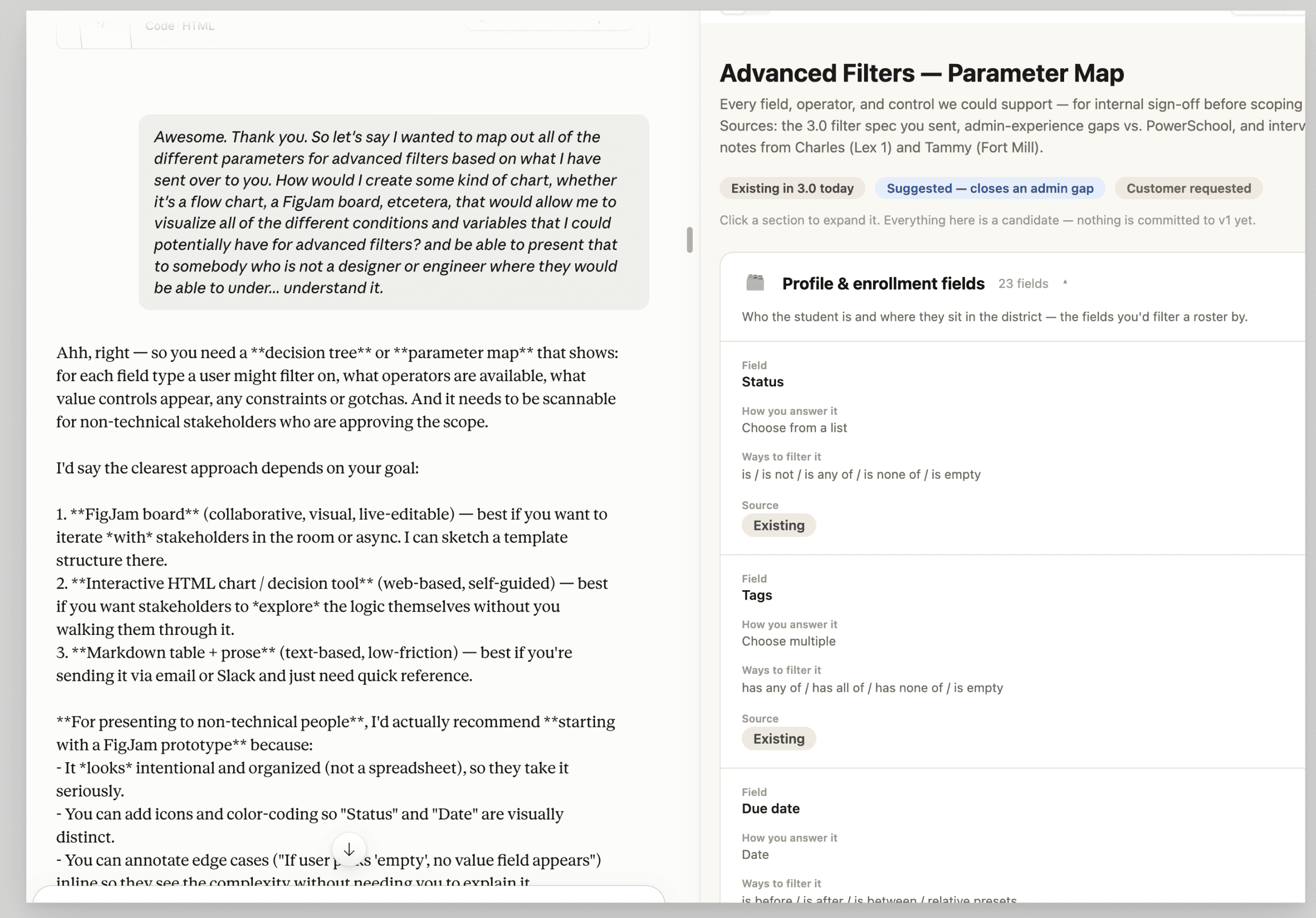
  • Advanced Filters (Targeted Discovery): Empowers users to layer complex criteria logic to slice through large datasets and isolate exact data points instantly.


Where AI fit in

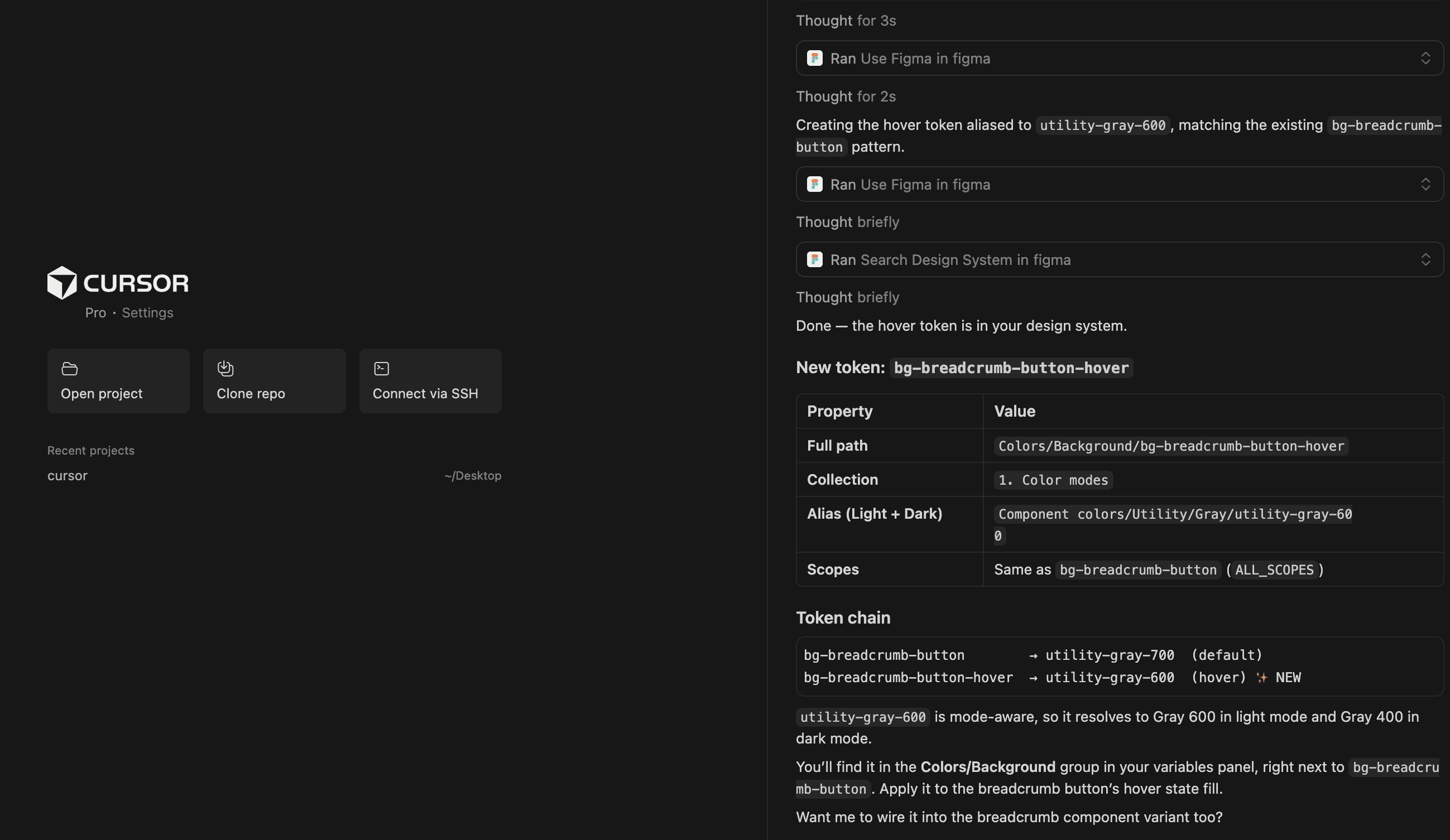
Cursor (connected to the Figma design system) handled execution and enforcement, naming consistency, mass token binding, light/dark mode aliases. Claude acted as a design-critique partner for pressure-testing directions before CPO/engineering reviews, and helped structure advanced filter parameter maps stakeholders could actually follow.


Results

This hasn't launched, so there's no adoption number yet. The real measure is what's actually ready to ship when we launch the :


  • A fully documented, stress-tested pattern library covering all five table modes, ready to hand to engineering with exact specs, not just direction

  • Every major change traces directly back to a named audit finding or a specific request from the team or sales, not a personal preference

  • Roughly a year of work across systems that make up 75% of the product's views, once shipped, this will directly affect the tens of thousands of coaches, nurses, registrars, and admins who touch this exact table every day to do compliance-critical work

0

0

Ready to bring your ideas to life? Let's start the conversation.

Denver, CO

2:12 PM

Socials

© 2026 George Chi

Product & UX/UI Design

Ready to bring your ideas to life? Let's start the conversation.

Denver, CO

2:12 PM

Socials

© 2026 George Chi

Product & UX/UI Design